- 2022
- Seedstock
- Digital Design
- Impression - Neat -
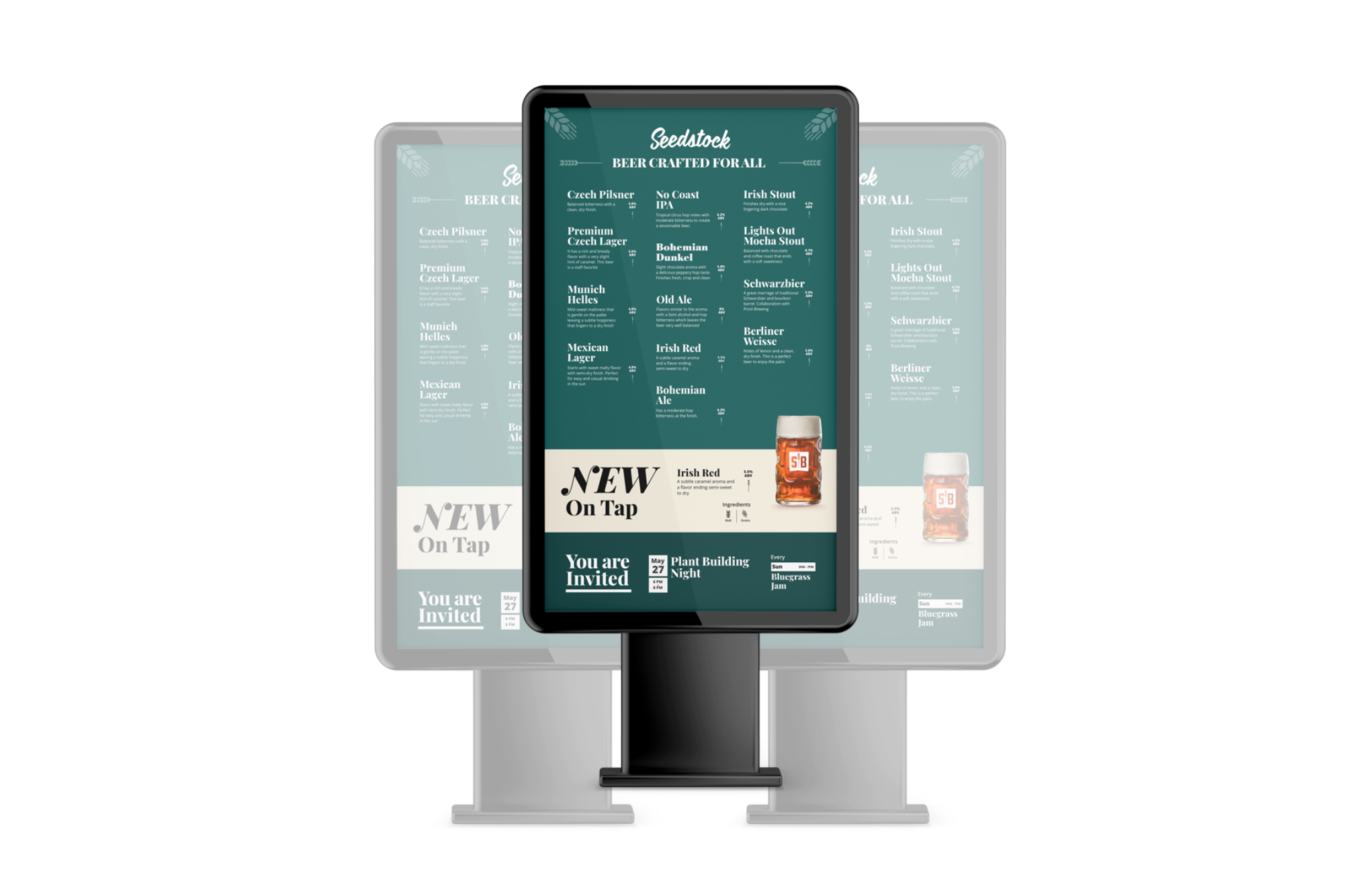
Seedstock was looking to update their menu from paper to digital and add new beer releases and events.
The design of the digital screen contains three sections. Every section has different content and goals.
Accessibility
- Eyesight 20/20 to 20/60
- Distance (screen to viewer) 9ft
- Contrast Ratio 12.92
User Experience
Section Ais designed to be the first element customers view as it is placed at the eye level. This section contains different background-color, bigger font size, and offset picture to attract customers’ attention and be the first section to view
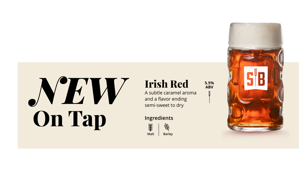
Section Bis designed to be the second element customers view. The bright white background and underline title is designed to drive customers’ attention to this section after viewing section A
Project made under the influence of

We are a design studio focused on creating verbal and visual identity of your brilliant future